
CIS
Master Pay
All payments and cards in one app.
FinTech app with P2P transfers, pay for services, save payments and other features.
My role
I was a Lead UX UI Designer for this project.
My responsibilities include:
• Drawing up a work plan
• Determination of terms
• Conducting UX Research
• Business concept development
• Define and approve key business and user goals
• Development team management
• Create reports and presentations for management
• Market and competitor research
My team:
Back & front-end developers.
Graphic designer.
Project
Master Pay is a payment application that allows users to transfer money from card to card, as well as make payments for services provided by online
services. It is also possible to pay in stores using a QR code.
At the moment, these 3 functions are programmatically implemented.
The design, structure and functionality of the application should be improved since the current version is MVP.
Goal
• Increased profits.
• Complete redesign of the existing application.
• Redefining business concept.
• Conducting tests and research on the market and user needs.
• Creation of a basic promotion model.

Workflow
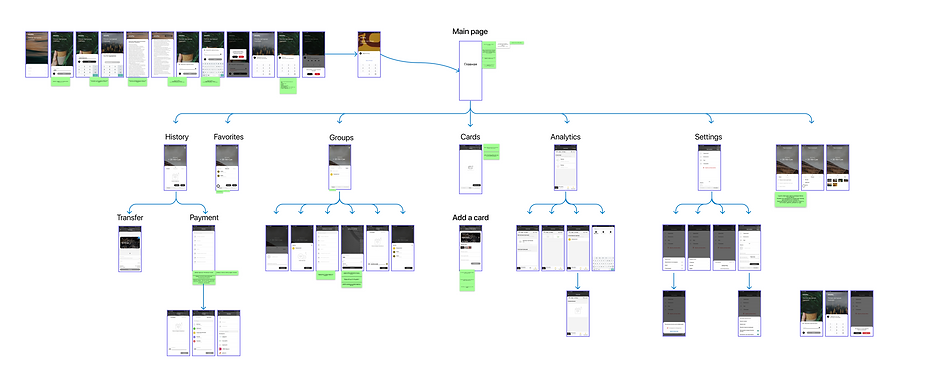
Old version of the application

In the beginning, I prepared a map of an existing application
I did this in order to determine the amount of work, if we consider only a redesign using only existing functions.
In addition, this is necessary in order to make it easier to track the user's path.
Next, I analyzed the interface for errors in UX and Ul
This was necessary because the management wanted to improve the MVP first, and only then start creating the second version.
I reviewed the entire application and based on the data collected during the tests a list of recommended fixes for MVP

Changelog applicable to screens

After that, I interviewed30 people.
Some of the respondents are active users of this application, and some use competitors' products.
Also, the selection included 6 people who have never used such programs in order to appreciate the simplicity of the interface for new users.

Personas

User Path
To find out what difficulties users may face on the way to achieving their goal, I ran several tests.
Tasks that were assigned to users:
• Register now
• Add a card
• Make a payment for utilities
• Transfer money to a friend's card
• Save payment
• Repeat saved payment
• Change PIN code
• Delete card
And other.


Analysis of comments and reviews about competitors' apps
• Reviews from Google Play Market
• Reviews from the App Store
• Reviews from other sites

Brainstorming
In order to find new ideas for the product and try to capture the whole point of view, I resorted to the Brainstorming method.
I looked at the product from a business and user perspective.
As a result, I got some interesting ideas and a fresh look at the product.


Sorting functions
In order to understand which functions should be included in the application and how to arrange them, I have undertaken sorting of functions by
parameters:
• Frequency of use
• Number of users interested in the function
The decision to place a function in one category or another is made on the basis of data collected during interviews with users.

Low fidelity wireframes
I drew wireframes on paper because this approach seems more intuitive to me.

Screens of the new design
This design is a concept. During the work on the final version, some parts were changed.


Interactive prototype

After the redesign ...
Even after launching the application with new design and functions, I will not stop improving the product.
After launch, we will receive a lot of valuable feedback from users that will help us make the product even better.
